網上版請按此
Information transparency helps in epidemic control
Five years ago, billionaire Bill Gates warned that the world's biggest disaster would not be a nuclear war but a global pandemic from a highly contagious virus.
He cited the Spanish flu in 1918, which killed 30 million people, and the Ebola outbreak in West Africa, which killed more than 10,000 people in 2013-2016.
A global influenza epidemic would not only result in heavy casualties but also cost the global economy over US$3 trillion, Gates said, quoting the World Bank's estimation.
Considering this horrific scenario, Gates called for a more robust global response system to prepare for the next pandemic.
Such a system requires the transparency of information. I remember 17 years ago, at the height of the Severe acute respiratory syndrome (SARS) outbreak, there was much panic in Hong Kong because of the lack of information and understanding of the situation.
In fact, I volunteered to create the world's first SARS infection map of Hong Kong. After working around the clock with the help of my colleagues, the map was launched in the city and beyond. Eventually, it was adopted by the World Health Organization (WHO).
From the SARS experience, we have learned that it is very important for the public to take early precautions to minimize the spread of the disease.
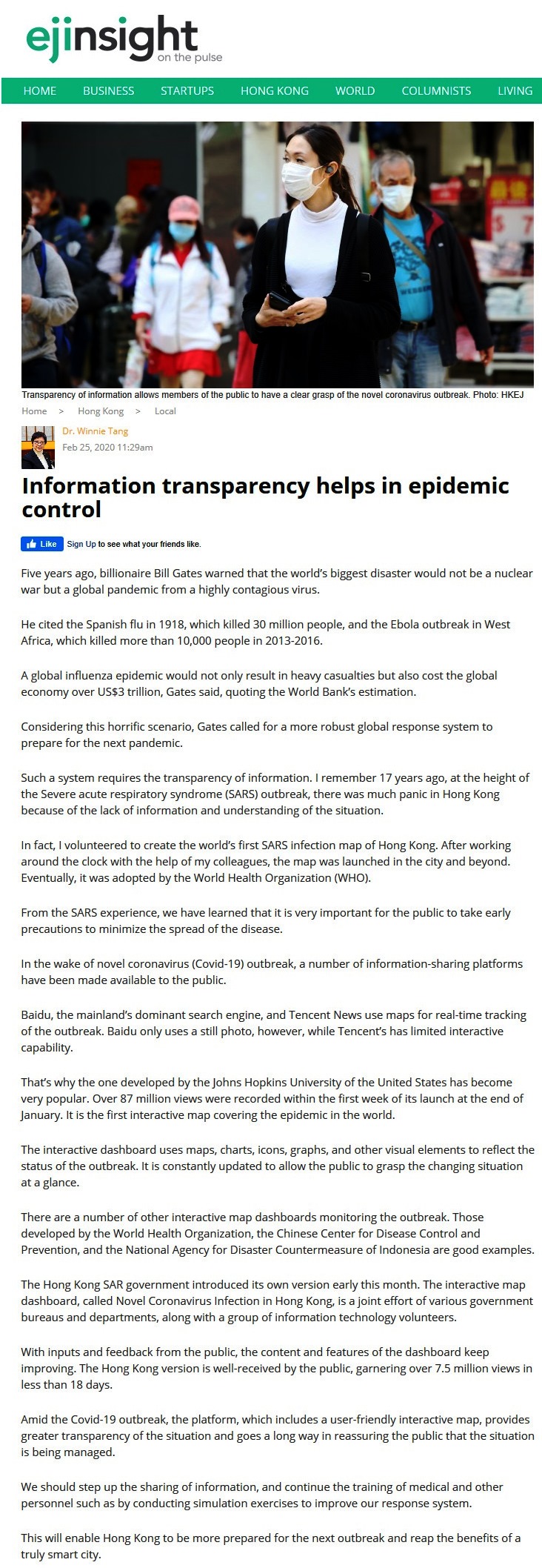
In the wake of novel coronavirus (Covid-19) outbreak, a number of information-sharing platforms have been made available to the public.
Baidu, the mainland's dominant search engine, and Tencent News use maps for real-time tracking of the outbreak. Baidu only uses a still photo, however, while Tencent's has limited interactive capability.
That's why the one developed by the Johns Hopkins University of the United States has become very popular. Over 87 million views were recorded within the first week of its launch at the end of January. It is the first interactive map covering the epidemic in the world.
The interactive dashboard uses maps, charts, icons, graphs, and other visual elements to reflect the status of the outbreak. It is constantly updated to allow the public to grasp the changing situation at a glance.
There are a number of other interactive map dashboards monitoring the outbreak. Those developed by the World Health Organization, the Chinese Center for Disease Control and Prevention, and the National Agency for Disaster Countermeasure of Indonesia are good examples.
The Hong Kong SAR government introduced its own version early this month. The interactive map dashboard, called Novel Coronavirus Infection in Hong Kong, is a joint effort of various government bureaus and departments, along with a group of information technology volunteers.
With inputs and feedback from the public, the content and features of the dashboard keep improving. The Hong Kong version is well-received by the public, garnering over 7.5 million views in less than 18 days.
Amid the Covid-19 outbreak, the platform, which includes a user-friendly interactive map, provides greater transparency of the situation and goes a long way in reassuring the public that the situation is being managed.
We should step up the sharing of information, and continue the training of medical and other personnel such as by conducting simulation exercises to improve our response system.
This will enable Hong Kong to be more prepared for the next outbreak and reap the benefits of a truly smart city.
Dr. Winnie Tang
Adjunct Professor, Department of Computer Science, Faculty of Engineering and Faculty of Architecture, The University of Hong Kong