網上版請按此
Three elements in making best use of interactive map dashboard
At the beginning of the COVID-19 epidemic outbreak in 2020, John Hopkins University in the United States launched the world's first interactive map dashboard on the epidemic information, which was well-received. The Hong Kong government immediately launched a local version, which greatly reassured the public. So far, it has accumulated nearly 80 million visits.
Due to their significant effectiveness, as many as 139 interactive map dashboards have been developed for the pandemic globally. There are three elements to ensure the best use of this tool:
1) Set clear goals
Is it used to facilitate coordination among departments? Or to improve operational efficiency?
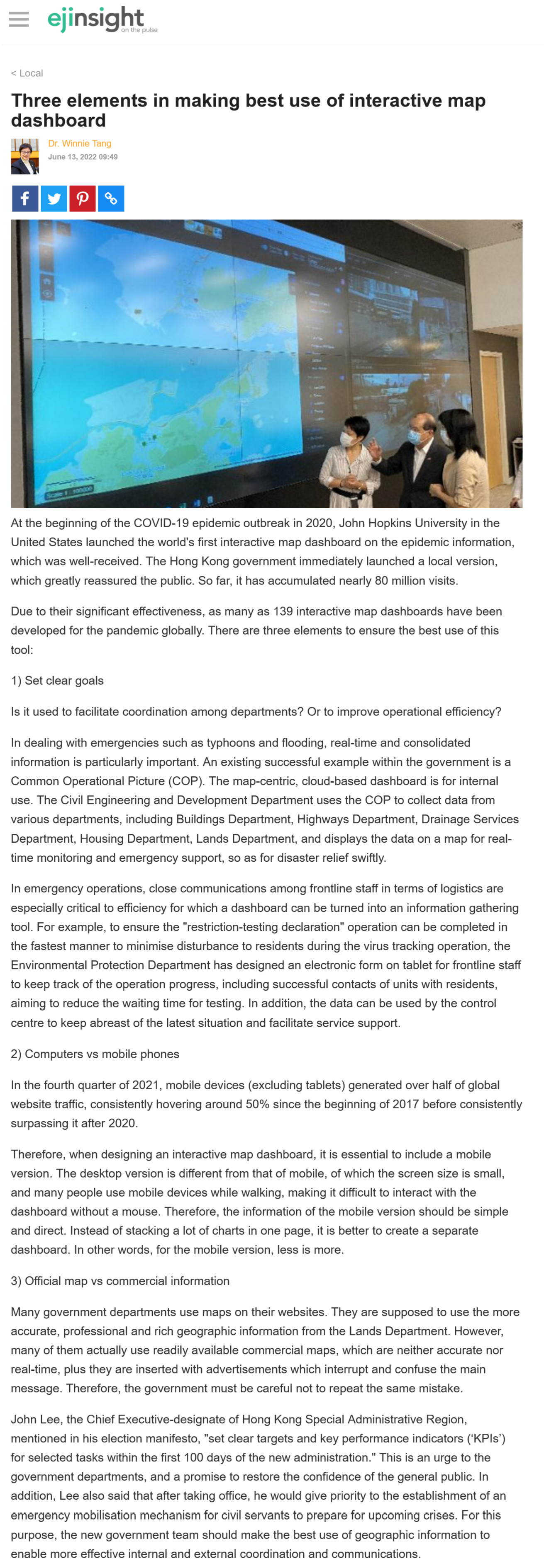
In dealing with emergencies such as typhoons and flooding, real-time and consolidated information is particularly important. An existing successful example within the government is a Common Operational Picture (COP). The map-centric, cloud-based dashboard is for internal use. The Civil Engineering and Development Department uses the COP to collect data from various departments, including Buildings Department, Highways Department, Drainage Services Department, Housing Department, Lands Department, and displays the data on a map for real-time monitoring and emergency support, so as for disaster relief swiftly.
In emergency operations, close communications among frontline staff in terms of logistics are especially critical to efficiency for which a dashboard can be turned into an information gathering tool. For example, to ensure the "restriction-testing declaration" operation can be completed in the fastest manner to minimise disturbance to residents during the virus tracking operation, the Environmental Protection Department has designed an electronic form on tablet for frontline staff to keep track of the operation progress, including successful contacts of units with residents, aiming to reduce the waiting time for testing. In addition, the data can be used by the control centre to keep abreast of the latest situation and facilitate service support.
2) Computers vs mobile phones
In the fourth quarter of 2021, mobile devices (excluding tablets) generated over half of global website traffic, consistently hovering around 50% since the beginning of 2017 before consistently surpassing it after 2020.
Therefore, when designing an interactive map dashboard, it is essential to include a mobile version. The desktop version is different from that of mobile, of which the screen size is small, and many people use mobile devices while walking, making it difficult to interact with the dashboard without a mouse. Therefore, the information of the mobile version should be simple and direct. Instead of stacking a lot of charts in one page, it is better to create a separate dashboard. In other words, for the mobile version, less is more.
3) Official map vs commercial information
Many government departments use maps on their websites. They are supposed to use the more accurate, professional and rich geographic information from the Lands Department. However, many of them actually use readily available commercial maps, which are neither accurate nor real-time, plus they are inserted with advertisements which interrupt and confuse the main message. Therefore, the government must be careful not to repeat the same mistake.
John Lee, the Chief Executive-designate of Hong Kong Special Administrative Region, mentioned in his election manifesto, "set clear targets and key performance indicators ('KPIs') for selected tasks within the first 100 days of the new administration." This is an urge to the government departments, and a promise to restore the confidence of the general public. In addition, Lee also said that after taking office, he would give priority to the establishment of an emergency mobilisation mechanism for civil servants to prepare for upcoming crises. For this purpose, the new government team should make the best use of geographic information to enable more effective internal and external coordination and communications.
Dr. Winnie Tang
Adjunct Professor, Department of Computer Science, Faculty of Engineering; Department of Geography, Faculty of Social Sciences; and Faculty of Architecture, The University of Hong Kong