網上版請按此
Enhancing communication helps fight the epidemic
It has been a year since the COVID-19 outbreak. In January last year, John Hopkins University (the "University") in the United States launched the world's first COVID-19 interactive map dashboard, displaying key information with maps and charts so that people can have a comprehensive view at a glance. The response was overwhelming, with more than 1 billion views every day.
After that, the University launched another initiative. In addition to the Global Map version of the map dashboard, a U.S. Map has been added to address the severe epidemic in America. The University's Centers for Civic Impact initiated the use of data to describe the situation in each county, the level of medical services and its affordability to citizens, in particular.
People can open the map dashboard and click U.S.Map, select a place, such as "Los Angeles" in "California", then they can view the details in that county. One can double-click the data grid to see three data charts, including: (1) Affordability—the proportion of citizens who have medical insurance, financed either by employers, government or individual and the uninsured, and the related age distribution; (2) Major ethnic groups— white, black, Asian, Indian and more, and age distribution; (3) The number of confirmed cases and deaths, and their ratio. In addition, it also lists the number of different classes of hospital beds such as intensive care; the number of the poor and those over 65 years old. In the meantime, as the indigenous communities are among the highest number of infected in the country, a section called Tribal Nations has been set up to draw people's attention to the situation of these communities. As Dr. Lauren Gardner, engineering professor and co-director of the Johns Hopkins Center for Systems Science and Engineering, told the Washington Post that the U.S. Map makes the infected population "becomes so much more human."
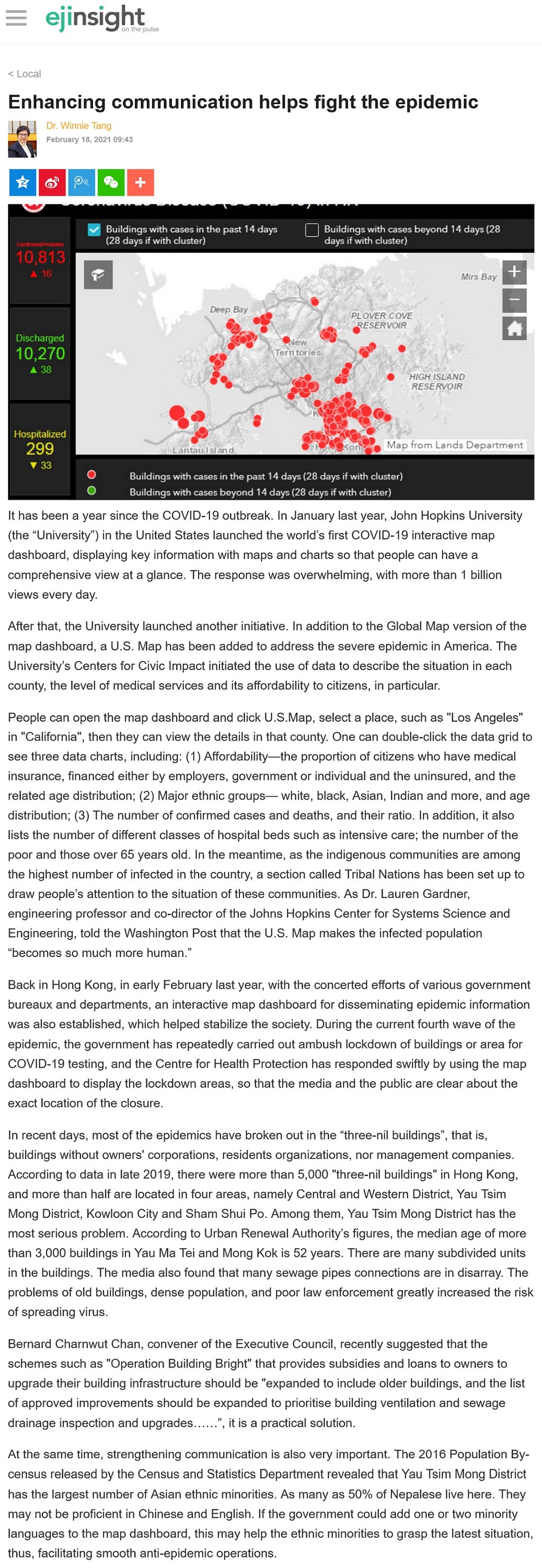
Back in Hong Kong, in early February last year, with the concerted efforts of various government bureaux and departments, an interactive map dashboard for disseminating epidemic information was also established, which helped stabilize the society. During the current fourth wave of the epidemic, the government has repeatedly carried out ambush lockdown of buildings or area for COVID-19 testing, and the Centre for Health Protection has responded swiftly by using the map dashboard to display the lockdown areas, so that the media and the public are clear about the exact location of the closure.
In recent days, most of the epidemics have broken out in the "three-nil buildings", that is, buildings without owners' corporations, residents organizations, nor management companies. According to data in late 2019, there were more than 5,000 "three-nil buildings" in Hong Kong, and more than half are located in four areas, namely Central and Western District, Yau Tsim Mong District, Kowloon City and Sham Shui Po. Among them, Yau Tsim Mong District has the most serious problem. According to Urban Renewal Authority's figures, the median age of more than 3,000 buildings in Yau Ma Tei and Mong Kok is 52 years. There are many subdivided units in the buildings. The media also found that many sewage pipes connections are in disarray. The problems of old buildings, dense population, and poor law enforcement greatly increased the risk of spreading virus.
Bernard Charnwut Chan, convener of the Executive Council, recently suggested that the schemes such as "Operation Building Bright" that provides subsidies and loans to owners to upgrade their building infrastructure should be "expanded to include older buildings, and the list of approved improvements should be expanded to prioritise building ventilation and sewage drainage inspection and upgrades......", it is a practical solution.
At the same time, strengthening communication is also very important. The 2016 Population By-census released by the Census and Statistics Department revealed that Yau Tsim Mong District has the largest number of Asian ethnic minorities. As many as 50% of Nepalese live here. They may not be proficient in Chinese and English. If the government could add one or two minority languages to the map dashboard, this may help the ethnic minorities to grasp the latest situation, thus, facilitating smooth anti-epidemic operations.
Dr. Winnie Tang
Adjunct Professor, Department of Computer Science, Faculty of Engineering; Department of Geography, Faculty of Social Sciences; and Faculty of Architecture, The University of Hong Kong