網上版請按此
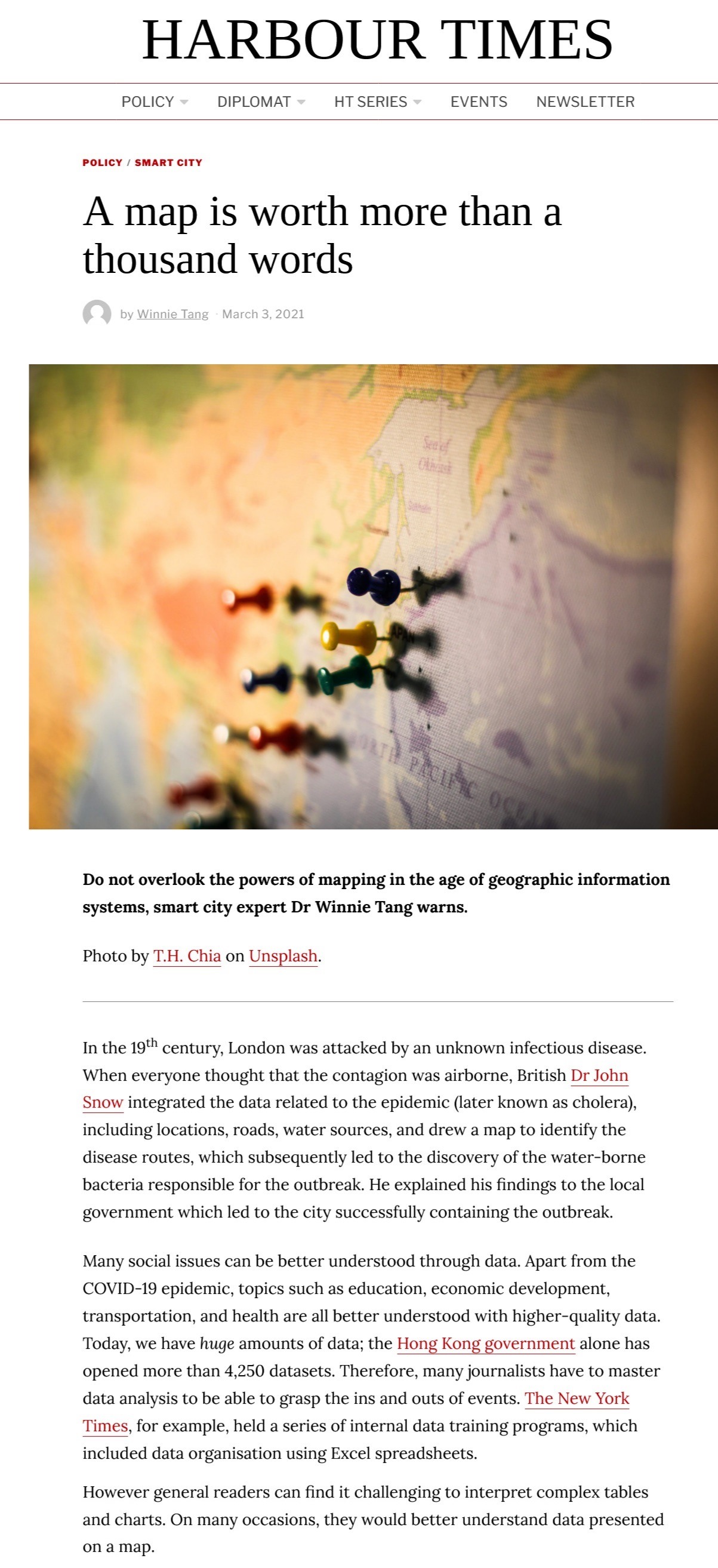
A map is worth more than a thousand words
In the 19th century, London was attacked by an unknown infectious disease. When everyone thought that the contagion was airborne, British Dr John Snow integrated the data related to the epidemic (later known as cholera), including locations, roads, water sources, and drew a map to identify the disease routes, which subsequently led to the discovery of the water-borne bacteria responsible for the outbreak. He explained his findings to the local government which led to the city successfully containing the outbreak.
Many social issues can be better understood through data. Apart from the COVID-19 epidemic, topics such as education, economic development, transportation, and health are all better understood with higher-quality data. Today, we have huge amounts of data; the Hong Kong government alone has opened more than 4,250 datasets. Therefore, many journalists have to master data analysis to be able to grasp the ins and outs of events. The New York Times, for example, held a series of internal data training programs, which included data organisation using Excel spreadsheets.
However general readers can find it challenging to interpret complex tables and charts. On many occasions, they would better understand data presented on a map.
Map me a story
For example, BNR NieuwsRadio, a Dutch media outlet used data from a crowdsourcing app to map the highway locations of speed traps. The map shows which sections of the road that drivers are most likely to be caught for speeding, making drivers more alert.
More and more reporters make use of maps to tell their stories. Researchers at the University of Hamburg in Germany found that in the Data Journalism Awards held by the Global Editor Network (GEN) from 2013 to 2016, half of the 225 nominated projects used maps.
However, if maps are used merely as a tool to display data, journalists may miss the opportunity to discover the stories behind them. The data processing and analytical functions of geographic information systems (GIS) which organise layers of information into visualisations can reveal patterns, relationships and situations.
For example, a recent primary election in Philadelphia City Council in the US brought the surprise defeat of a council member who had held office for 27 years. You can map the results by voting district and see which parts of the district voted for the incumbent and her challenger, and then infer the causes, such as an increase in young voters and new immigrants.
But if you want to verify these guesses, you need to turn to GIS by pulling data such as demographic characteristics and property prices by voting district. In Philadelphia, you can see that the challenger attracted huge margins of support in wealthier areas with more expensive housing and higher-educated voters.
GIS can be widely applied, from tracking the epidemiology of public health in COVID-19, emergency rescue, country park management, flood forecasting, school placement allocation (for students who intend to study in a government/subsidised school, they need show residential proof to qualify) and traffic management to housing planning and online shopping services.
Careful, responsible use
While the waters can keep a boat afloat, they can also overturn it. In the US presidential election last year, the media showed the Republican Party supporters in bright red on the map and the Democratic Party in blue, which made people mistakenly believe that Republicans were leading while the opposite was true. Betsy Mason, a journalist who studied geology, reminded her peers that readers are very prone to believe things that they see on maps, so media workers have to be careful, responsible and understand that maps are "not just illustrations to break up the text."
At the peak of the epidemic in Hong Kong, local newspapers used maps to show the location of COVID-19 cases in various districts. However, their mapping approach is traditional and static and seldom uses advanced technology like GIS to analyse the spatial-temporal relationship, like showing the linkage between the infected groups and the demographic characteristics of certain areas within a particular period of time. As a GIS professional, I look forward to more exploration and trial application of this innovative technology by media practitioners so that readers can easily understand the dynamics of the issue as presented.
Dr. Winnie Tang
Adjunct Professor, Department of Computer Science, Faculty of Engineering; Department of Geography, Faculty of Social Sciences; and Faculty of Architecture, The University of Hong Kong.